What makes a good web design? And how did we start?

It’s gotta be the heavy use of tables
What makes a good web design a great web design? We’ll tell you, but first – ever wonder how web design came to be?
Not many know about the early days of the web, when there were no images, no colors, and no sound … just plain old line by line text!
The launch of the Web
One day in 1989, Tim Berners-Lee, an employee at CERN, proposed a global hypertext project that came to be known as the World Wide Web. At first, text-only pages were the norm and could only be viewed with a simple line-by-line browser (interested or nostalgic? try out the Lynx browser).
In 1993, Marc Andreessen and Eric Bina created Mosaic browser, which was revolutionary at the time as most were based on Unix and none were capable of media such as images or sounds.

They could have spent some of that time making a better logo… bleh!
In October 1994, short off the heels of Mosaic, the W3C was launched:
The W3C mission is to lead the World Wide Web to its full potential by developing protocols and guidelines that ensure the long-term growth of the Web
an effort which is still in force today.
Fight for control
With the creation of the W3C, also known as the World Wide Web Consortium, browser makers were forced to build their programs based on a certain specification to ensure the ease of use for both consumers and web site creators. Somehow not discouraged by this fact, in 1994 Andreessen formed Communications Corporation, which later became Netscape Communications. They didn’t really care much for unification.
Netscape was a force to be reckoned with as they decided to go out on their own and create custom supported HTML tags and abilities, often forcing web developers to “sniff out” the browser type in order to provide the best possible service. Check out this run-down of user-agent sniffing if you want to laugh a bit in a nerdy way. Netscape basically made life hard for users, designers, and web developers.
The biggest contender to Netscape and their browser Navigator was Microsoft with their Internet Explorer, and both groups were part of an overall effort (in their own weird ways) to create new scripts and features like CSS, JavaScript, and DTHML … but this was just the start. Microsoft made the first major competitor to Netscape, which shifted the state of the web world dramatically.
Web Designers wanted
When Microsoft launched its first major browser in 1996, they gave designers the world – it had custom tags and features just like Netscape Navigator, it was the first browser to support cascading style sheets, and with it, designers realized the potential for …
The potential for … gosh I can’t even say it!
Ugh … the potential for table-based layouts.

Bad. Very very bad.
This allowed webmasters to create sites with multi-columns, regions, and complex layouts than were ever possible before. But the semantics and compatibility of sites were nowhere on their radar. Needless to say, nothing was done to improve the ease-of-use for site visitors.
For many, the opportunity to make a site look nice and pretty outweighed the chance to make it work for the diversity of visitors or adhere to standards-based coding. They also utilized tricks like empty spacer images, negative space hacks, and table colspan attributes to make pretty unique web pages.
Fixing the system
In response to the abundance of actual designers using the web as their medium, W3C ushered in CSS support in 1996. The major advantage that CSS brought was the fact that it allowed HTML code to once more be semantic rather than both semantic and presentational, as well as sometimes purely presentational.
Plus, using CSS helped to improve web accessibility for older browsers!
Another helpful tool that was added in 1996 was Future Splash. Haven’t heard of it? If you use the web at all throughout the day then you see it all the time. Most people call it Flash nowadays.
Flash gave designers a powerful method to present equivalent and enhanced experiences in all browsers that supported it. As the plugin grew, designers got more ambitious and began to use it to power entire sites (some still do).
Standards and best practices
Compliance issues, accessibility woes, and developer push-back egged on the The Web Standards Project, which was started to promote browser compliance with HTML and CSS standards, and also ended becoming a champion and partner for Open Source initiatives and projects.
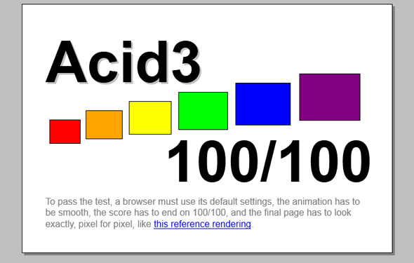
With the creation of the Acid1, Acid2, and Acid3 tests, browsers were forced to adhere to specifications so that their users would get a beneficial experience.

Acid3 test in the latest version of Firefox
With a heavier effort on best practices, designers were now responsible for providing a site that looked great, worked great on all major browsers, and one that was built in compliance with modern standards.
Web developers came into play more, as designers could create and prototype code and designs to be handed off to experienced web script experts to polish them for public consumption.
Nowadays, modern browsers have made it much, much easier to make websites quickly without any hacking.
Internet Explorer 9, Chrome, Safari, Firefox, and Opera are all very good at handling and adhering to the specifications setup by the W3C – which means you have zero excuse for bad code!

Standards compliance rules! [credit: Immortal Wolf]
What makes a good web design? Six things that make a great site design
1. Graphic Design
The visual appearance of your site is the first things visitors see – it’s got to be appealing. It also needs to represent your brand and the tone of your site. If it doesn’t impress, people can and will leave your website. Site visitors want to be impressed by your design.
That also means any marketing material for your site must be on par with modern standards and design philosophies, otherwise you might have people join your unsubscribe list.
2. UX / User Experience
What’s the point of a pretty website if users can’t easily figure out how to use it, or how to get where they need to be? Things have to be labeled, in the right place, and easy to find!
Usefulness is a key factor, as a user who feels hindered or bothered by using your site will probably leave it sooner. Universal web design guidelines are key, start here.
3. Typography
More than just simply being able to read text clearly, a website with good typography allows users to ready quicker, glean small chunks or ideas, and be comfortable in their efforts (no eye-straining tiny fonts!).
On top of that, aesthetically pleasing font and color usage make sites more appealing. As with other areas of your site, sticking to standards and accessibility are a must – using web-safe fonts are always a good and recommended idea.
4. Coding
Standards, best practices, browsers optimization, browser compatibility, HTML and CSS compliance – all wonderful things that actually (believe it or not!) make building websites faster.
If you write your code with more care to adhere to standards, most browsers will display things very well and will appear similar to other browsers when placed side-by-side. It’s a win – win.
W3C can help you if you need to validate your CSS code or HTML markup, and JSLint can help you clean up your JavaScript code. Also take a look at Aptana to improve your coding from the get-go.
5. Page Layout and Structure
Making site pages consistent is key – users will be shocked if they find that the site is drastically different from page to page.
Having the navigation and footer items in the same spot are a good start, and putting the “main content” in the same general area are surefire ways to make your site better.
Grid-based layouts are a good choice for a forward thinking designer, and having a site width less than 1024 pixels wide is also smart planning.
Pages that can be found in less than three clicks (or search) means you have a good site structure, as users don’t have to “hunt” for your content.
6. Device Support and Optimization
In terms of mobile, desktop, cell-phones, and all other web-enabled devices out there, the best route to go for new designs is Responsive Web Design.
Responsive Web Design is a methodology utilizing CSS media queries to ensure the best possible appearance in all types of user’s browsers. This means making things relative-based using percentages instead of pixel dimensions, and having fluid layouts that adjust to the user’s screen size and capabilities.
